I am actually trying to sell something here. I don't think I'm doing a hard sell. I don't think I'm being strident or pushy. But, I would like it if there was less consumption all around the world. I'm promoting that idea at this free site. I'm showing through my own family's example how people could make alternative choices about buying stuff and what people could do instead of purchasing things at Walmart or Best Buy. I would like it, if this idea caught on.
I have said in a previous post that I feel that life is fragile and short and whatever gets you through the night is just fine with me. I'm not going to judge you for going to Walmart and getting a dozen sweater shavers because they're on sale--how could you NOT buy them!!!!???? I'm not trying to fool you into being more conscious about your own consumption, I'm just trying to help you think about your own consumption. I am not without an underlying purpose here, but it's not insidious, and I think I'm up front about it.
Knowing, as I do, that marketing does sell, I am trying to see how this blog could be more appealing. How could I make changes that draw in more people, that keep them engaged in a way that they are then even more receptive to my upfront not-at-all insidious message? Packaging sells. How could I package this blog differently?
I kind of like the spare quality of this blog. Colors show up in some of the photos and it feels pleasant. It's not too jarring, in my humble opinion. On the other hand, maybe a bit more color would liven things up. What if I fooled around with the colors a bit?
Would the yellow background, here, make the blues and greens more lush and soothing? Would it bring a certain warmth and comforting feel to the blog? Would it lend a brightness like a sunny day?

What about this blue background? Would it seem more moody, or ethereal or placid? Would the blog take on a more subdued quality? When I write about serious or somber things, would the subjects gain some additional credibility by virtue of the blue?

Would this muddishy color bring out an earthiness to the blog? Would our more down-to-earth lifestyle be reflected more in this earthier color? Although, it's kind of hideous isn't it?

Um, no. Not up for debate. Not even under gun point. Not avant garde, not interesting, not urban and cutting edge. No. No, no, no, no, no.

ACK!!!!

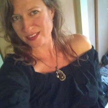
Leave a comment and vote. What do you think? Should it be white, yellow, blue, mud, orange, or purple?


3 comments:
Of the choices, I like the blue the best, but I think it looks nice with the white background. It's very easy to look at. =)
Keep the white. Nice a pure. You could put a nice Pepsi wallpaper on the background of the blog. Imagine the swirling blues and reds.
I like the yellow, but like the previous posters, I think I prefer your clean white present to any of the choices.
Post a Comment